Fueled by curiosity, I’m a thoughtful designer who makes friendly, useful and clear websites & apps.
- Web & product design
- Design systems
- Code & tooling
- Strategy & branding
- Writing & docs
- Team collaboration
Why me?
I seek balance in design, speed, code and craft. I strive for simplicity and clarity. I live and breathe the web. I’m ever-curious.
“Quality is inherent in all of his endeavors; Dave’s approach is not to simply follow the most direct path to completion, but to contribute to a well-considered product. The clean, colorful and elegant look of our web site is a living, breathing example. His positive nature and supportive attitude of other’s ideas invigorates the workplace with a can-do mindset that is infectious.”
— Dean Rusk, Creative Director (35 years) at WaterMatters.org
Inspiration
John Muir, Lego, taking things apart, HTML5, slab serifs, the Dada art movement, do-it-yourself attitudes, critique and reflection, black ink, learning by doing, hiking trails, walking streets, and happy accidents.
Kongruent Design System
I created the Kongruent design system, product design standards, and fostered strategic alignment between Marketing, Engineering and Product teams.

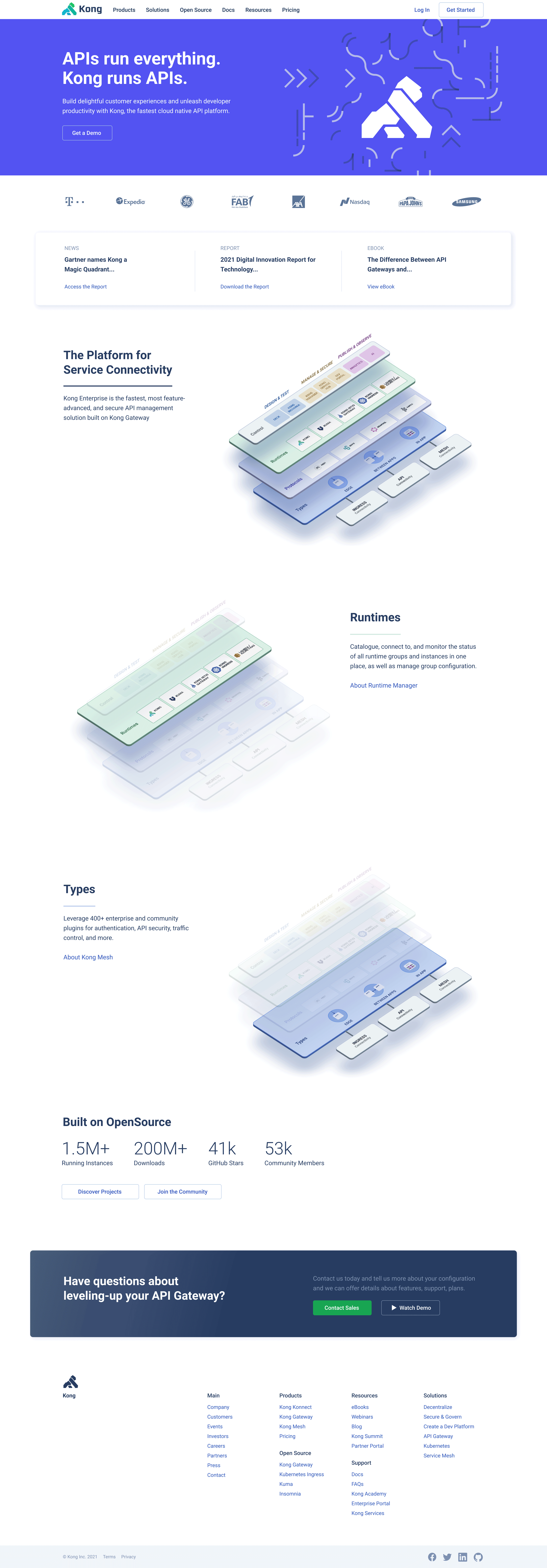
A redesigned KongHQ.com using the new grid, spacing, typography, color refinements, new content patterns and hero design. (Isometric illustration by Fernando Machuca) Beyond web pages, my product design work included standards for illustrations, empty states and system-level pages, email templates and custom dev portal themes.
Creating Alignment & Rhythm
The Kong website grid was inconsistent with various CSS breakpoints and column gap sizes. After designing a new typography and sizing system, I set off to create a consistent 12-column grid to address a wider variety of content. To get the details right I created a 28px grid for vertical rhythm. This ensured all elements on the page shared a consistent baseline, creating a readable and well-spaced flow of content from top to bottom.

The old site grid was confusing; the new grid creates consistent vertical rhythm that makes for both a pleasant reading experience, and designers and developers know exactly where to place elements.
Making Components Reusable
Over the years various designers and developers had created elements that felt disparate and varied without good reason. Starting with a website audit to find opportunities to consolidate, refine and simplify design patterns, I created content wireframes to ensure we covered all the content cases. Then I designed high-fidelity content components for every pattern.

The Kongruent Website Design System accounts for a variety of content goals, types, and sizes while providing consistent spacing, typography, and a reserved but useful color palette.
T-shirts, Too
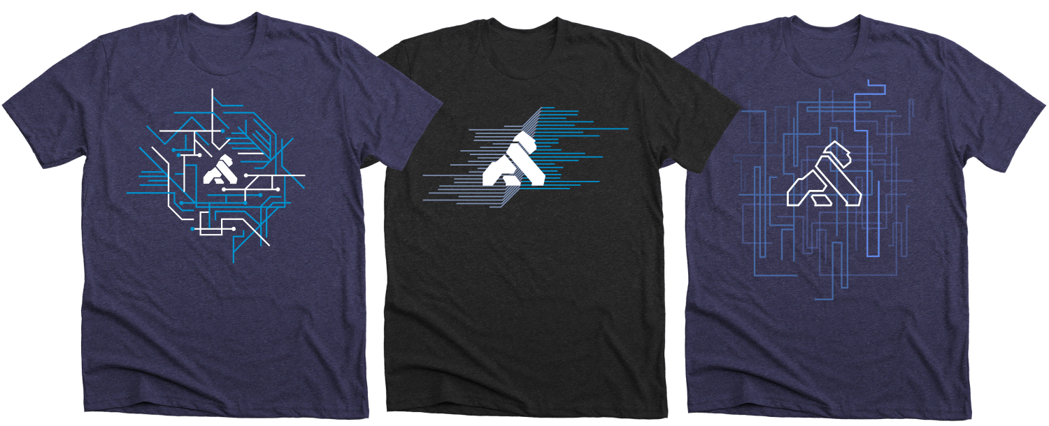
Shirts are one of my favorite things to design. It's quite a compliment when someone likes your design work so much they are willing to wear it!

Shirt designs for various conference swag; my favorite is on the left.
Optimizely Product Design System
My work supported more than 50 Frontend Engineers, Product Designers, and Product Managers to ensure efficiency and design cohesion across Optimizely products.

A mature design system is more than a UI library; it’s a healthy and well-maintained product that provides helpful context for designers and developers.
Growing a Design System
During my time at Optimizely I helped grow our design system from a pattern library to an essential and well-documented living product. My initial focus was to design and develop new features, document design decisions, and provide support on how to use the system. Later I helped shape company-wide design processes, hire and grow the Design team, and presented progress at key meetings.
Start with the Writing
I created many core pages of our style guide regarding layout and flexbox, color and typography, custom CSS and helper utilities. Good documentation includes insight into the design process, revealing helpful contexts and constraints that went into specific solutions.

These examples of React component documentation includes a mix of real examples using actual code, clear descriptions of available properties and options, and what to do when you get stuck.
Leading a Design System Rebrand
In 2020 Optimizely rebranded and the product required an entire design overhaul. I was in charge of implementing the vision of the rebrand, updating the design system and product to feel new, on-brand, and polished with attention to detail.

Before the rebrand. This demo page I designed helped me identify potential CSS text wrapping issues along with type consistency, spacing and other common interaction issues.

After the rebrand. I worked to ensure all colors were updated to the new brand palette, new typography was updated throughout components and products, as well as new spacing, border radius and other key details.
Increasing Design Cohesion
Over time we saw design inconsistencies emerge between old and new components. To solve these gaps I met weekly with fellow designers to identify eyesores and UX gotchas, and prioritized issues important to the user experience. We fixed 100+ product design issues this way, and design quality across all of Front-End Engineering increased. Read about Polish Day.

I collaborated with more than 50 wonderfully helpful and smart Frontend & UI Engineers, Product Designers, UX Researchers, Product Managers and more to ensure high quality design standards across Optimizely.
Tools Over Rules
Like most products, Optimizely added many CSS colors over the years. To meet developers where they are, I created a tool that warns you about non-standard colors on every build, and suggested the nearest design system token. Engineers loved it!

I made two color tools, one for designers which converts your custom color into the closest color in our design system, and a more automated method for the engineers.
For the Walls, Too
During a company hackday I went back to my roots in art and high jump. Optimizely’s company story mentioned the evolution of the high jump technique. This artwork hung in the San Francisco and Amsterdam offices.

Hackday poster, 36x48 in.
O’Reilly on Inkling
I created the design system for O’Reilly on Inkling serving desktop and mobile-friendly versions of their 50 most popular programming books, along with tools to design and build at scale.

I was honored to redesign these iconic technical books for flexibility in a variety of reading environments.
From Print to Web
My work at Inkling began translating print textbooks into refined sets of design patterns and templates. This process started with single books, then grew to series of books, and finally to entire libraries of content spanning nearly 1,000 titles.

The O’Reilly books required print to digital translation as well as design refinements to make them mobile-friendly.
Iconic Minimalism
O’Reilly books have a stellar reputation, and I was grateful for the opportunity to work on these iconic books. All Inkling books can be purchased by the chapter, so to retain branding each chapter header was redesigned to include the cover artwork. Part of my design work involved reading books on my phone, looking for ways to refine the user experience and ensure it was up to my standards.

My designs had to account for a variety of chapter header styles, image sizes, and other dynamic content patterns like code samples and interactive quizzes.
QA Tools for Scale
I built several tools to treat books more like databases, making it easy to transform or analyze parts. The Figure Enhancer tool helps authors mark figures in a book that require further code and image enhancement, a manual and error-prone set of tasks until my tool helped automate several steps in the process. And the Discover tool helps analyze HTML patterns in a book and spot inconsistencies and frequency of HTML patterns and code reuse, offering a visual histogram of HTML elements and CSS class names.

Both the Figure Enhancer and Discover tools helped save production time making books and finding errors and inconsistencies at scale. I made these from 0-1; from concept, to design, to working code prototype used by others.
Elsevier on Inkling
I created the design system for Elsevier on Inkling that served almost 1,000 responsive books used by 500,000 doctors, residents, and medical students globally.

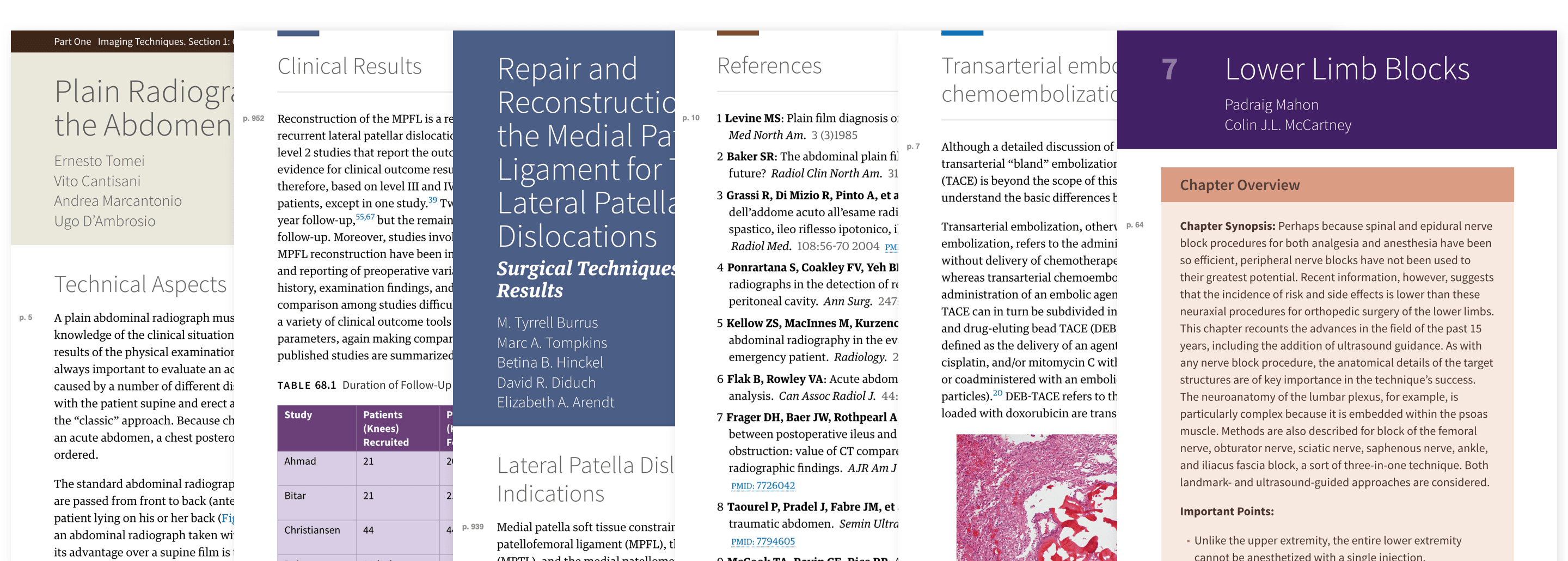
These Elsevier medical textbooks contained a wide variety of content patterns from tables, lists, nested lists and image sizes all nicely solved by the design system.
Style and Code
I created the Elsevier style guide to democratize design and allow us to translate nearly 1,000 unique print textbooks into elegant, useful and flexible digital books. By following simple steps, anyone could create a unique theme using a combination of color, typography and style variables. This made creating families of books, as well as individual titles easy and reliable. Textbooks tend to have a wide variety of content patterns, which made for interesting design constraints. New designs must work well across a variety of reading devices like phones, tablets and desktops.

The power of this design system allowed for anyone to style a complete book that was consistent with the print textbook simply by setting a handful of design variables.
Converting HTML at Scale
I was lead designer on a task force to imagine, prototype, and ship a tool to batch convert XML into HTML patterns. A user would select a series of XML elements and map them to a corresponding HTML/CSS design pattern. The tool would match all elements throughout a book and transform them into well-formed markup that looked great using our starter CSS template for ebooks.

I was lead designer on this prototype (left) and final Mapper (right) tool used to convert hundreds of textbooks by content experts.
Enabling Good Design
Each of the nearly 1,000 books required creating chapter thumbnails images, a process that often involved a designer. I created a web tool anyone could use to export attractive chapter thumbnail images, including icons for frequently used chapter types like glossary, index, quizzes, etc. This tool was loved by non-designers, saved hundreds of hours, and helped ship books faster.

I designed and coded this simple tool to create consistent chapter thumbnail images within a range of theme options that are easy to adjust.


